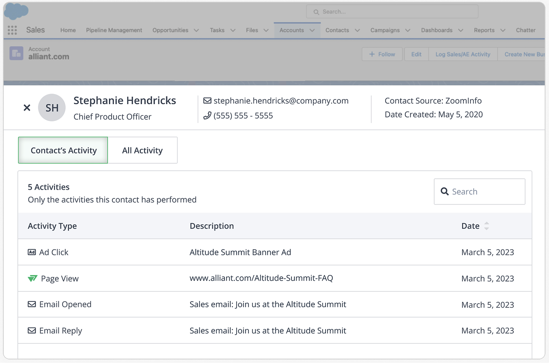
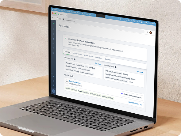
Lead Product Designer
ScopeResearch, product strategy, interaction design, prototyping, usability testing
Five Tabs
Walk Into
a Bar…
I transformed a fragmented sales workflow into one focused experience—helping reps find useful information faster and giving the product a clearer reason to exist.
One focused workspace. Less hunting. More selling.
Instead of asking users to jump between disconnected dashboards and tools, the redesigned Sales Insights experience brought the most useful information together into a single workflow.
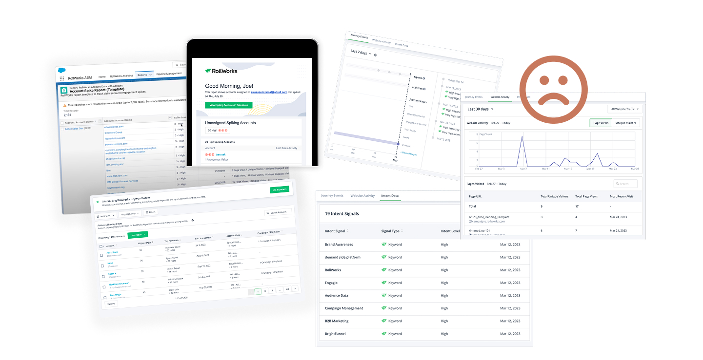
The workflow was scattered everywhere.
Sales reps were navigating between multiple tabs, dashboards, and disconnected tools to understand a single account. The experience required too much hunting and too much memory.
My job was to understand which information actually mattered, remove unnecessary complexity, and turn the workflow into something coherent.
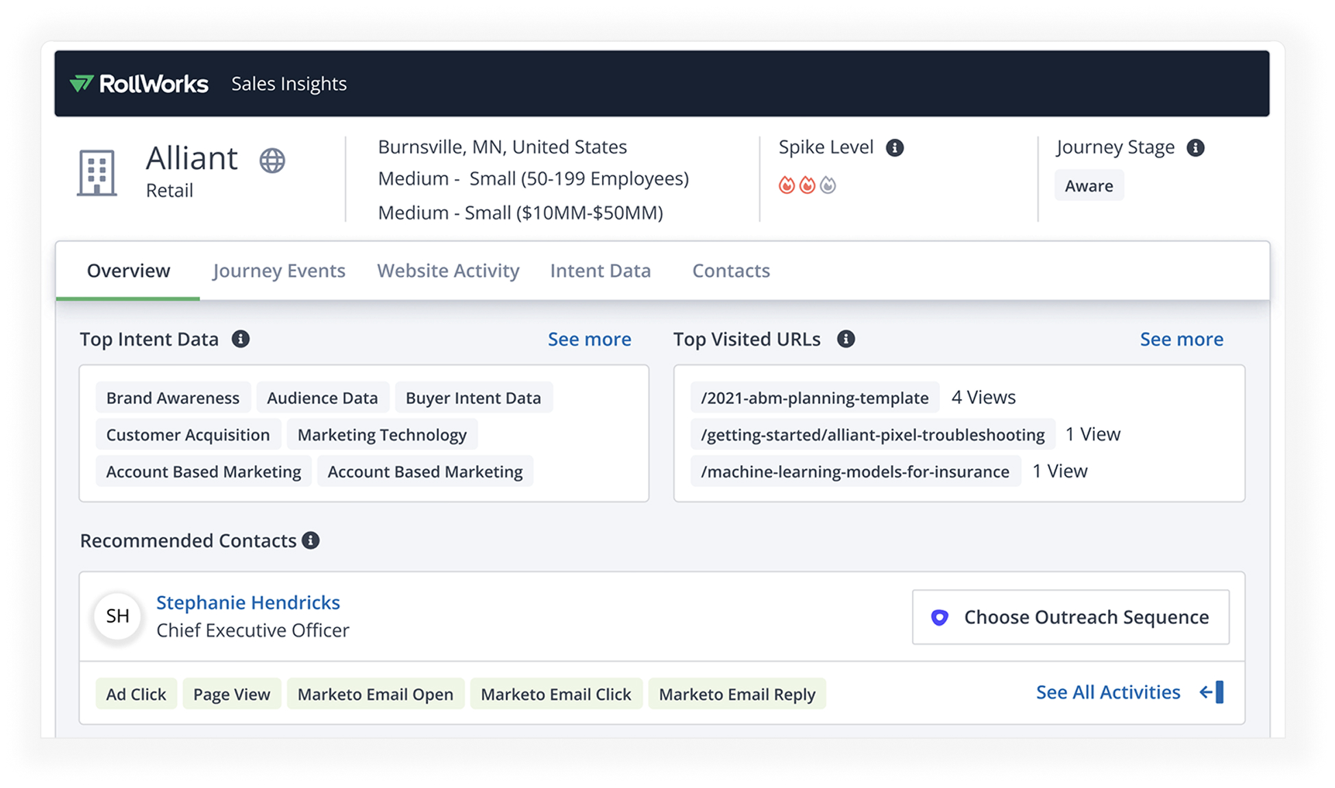
First, figure out what people are actually trying to do.
Rather than beginning with screens, I mapped the workflow: what sales reps were looking for, where they went to find it, what slowed them down, and which pieces of information actually affected their decisions.
This helped separate useful decision-making information from everything that simply happened to be available.
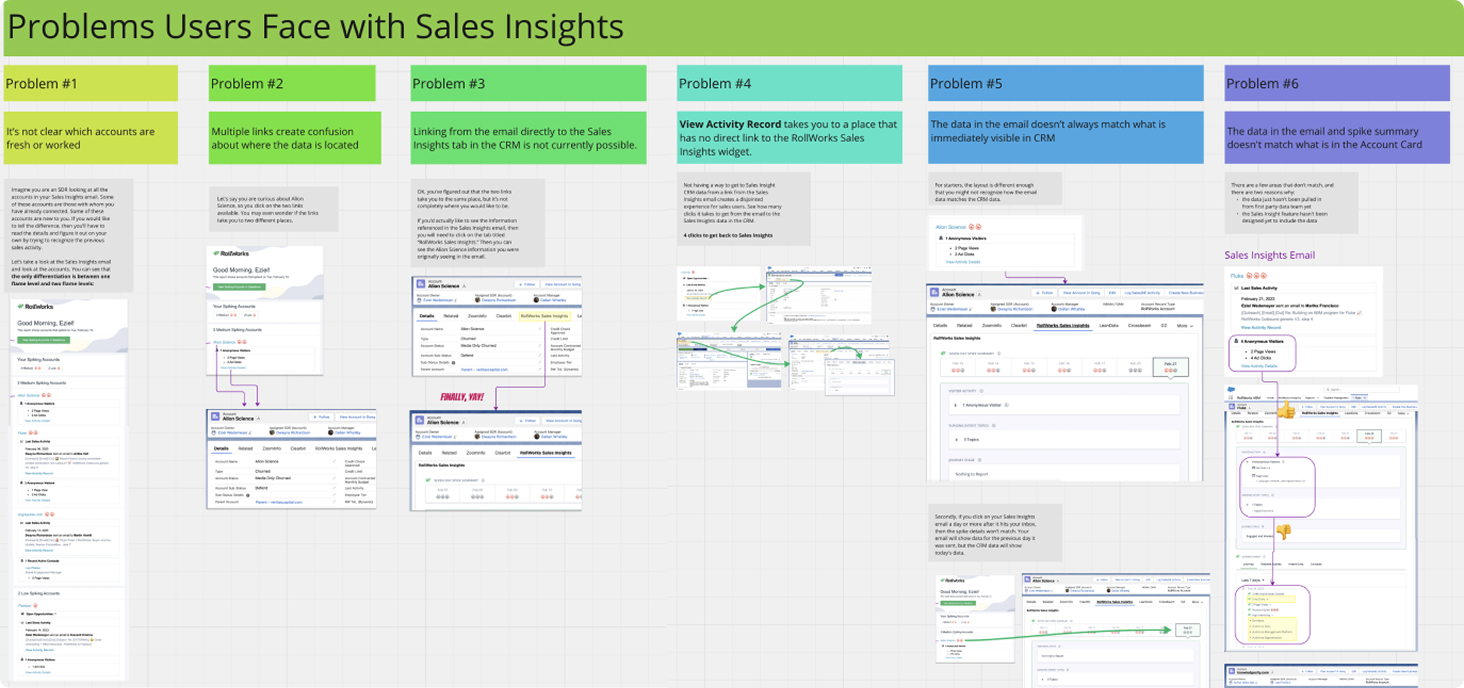
Five tabs became one experience.
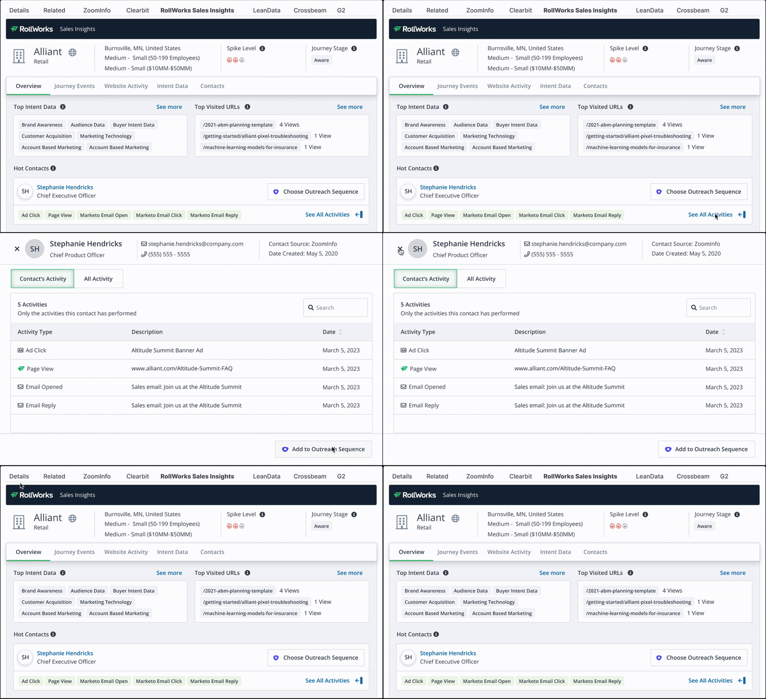
The redesign brought related account intelligence into one workspace and established a clearer hierarchy so users could move from overview to detail without losing their place. All within their beloved Salesforce.
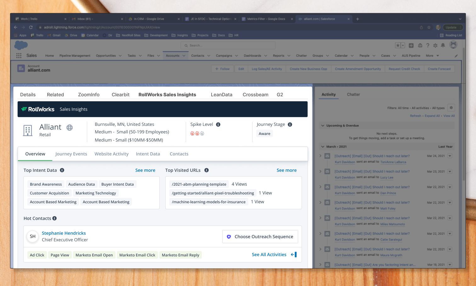
Not every piece of information deserves equal weight.
The new design emphasized the signals that helped a rep decide what to do next while making secondary detail available without allowing it to dominate the screen.
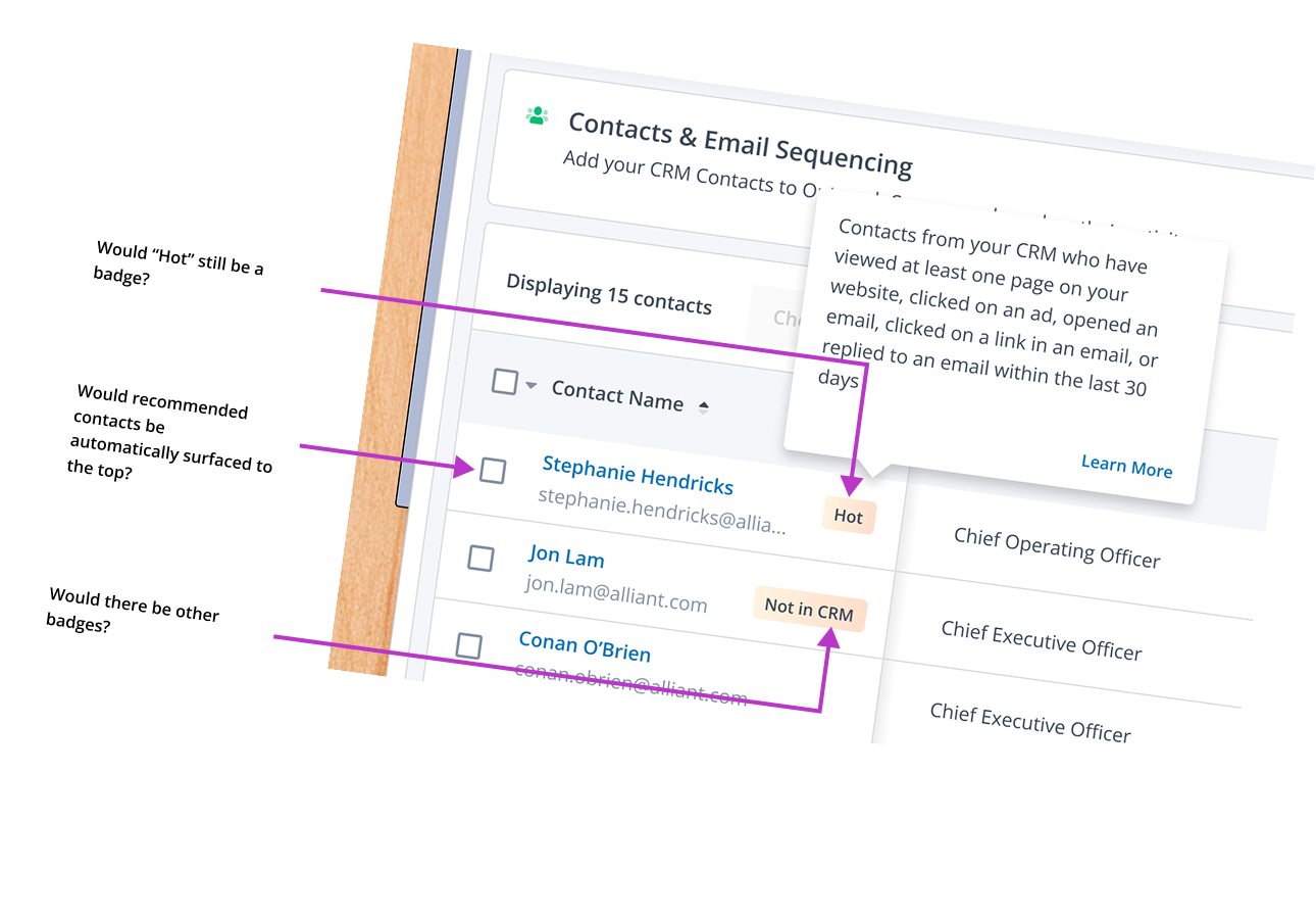
You can find signal in the noise.
Testing helped refine controls, allowing users to drill down on one prospective person and seeing all the actions they had taken so far.